


Clarisse Portfolio
A modern, customizable, and responsive portfolio template built with Next.js and TypeScript. Designed to showcase your skills, projects, and personality with a sleek interface, animated background, and professional features.
Live Demo: Check out the deployed version at clarisse-portfolio.vercel.app
Badges


Table of Contents
- Features
- Screenshots
- Getting Started
- Usage
- Customization
- Project Structure
- Built With
- Dependencies
- Releases
- Key Features Explained
- License
- Acknowledgments
- Contact
- Contributing
- Support
Features
- Light/Dark Mode: Toggle between light and dark themes seamlessly.
- Fully Customizable: Adjust colors, fonts, and content to match your brand.
- Responsive Design: Optimized for mobile, tablet, and desktop devices.
- Animated Background: Dynamic particle animations for visual appeal.
- Smooth Animations: Powered by Framer Motion for fluid transitions.
- Modular Components: Well-organized, reusable component structure.
- Interactive UI: Includes tooltips, hover effects, and engaging elements.
- SEO Optimized: Built with search engine visibility in mind.
- High Performance: Fast load times and optimized assets.
- Skills Visualization: Dynamic representation of your expertise.
- Blog Section: Share articles and insights.
- Testimonials: Display feedback from clients or peers.
- Contact Form: Easy way for visitors to reach out.
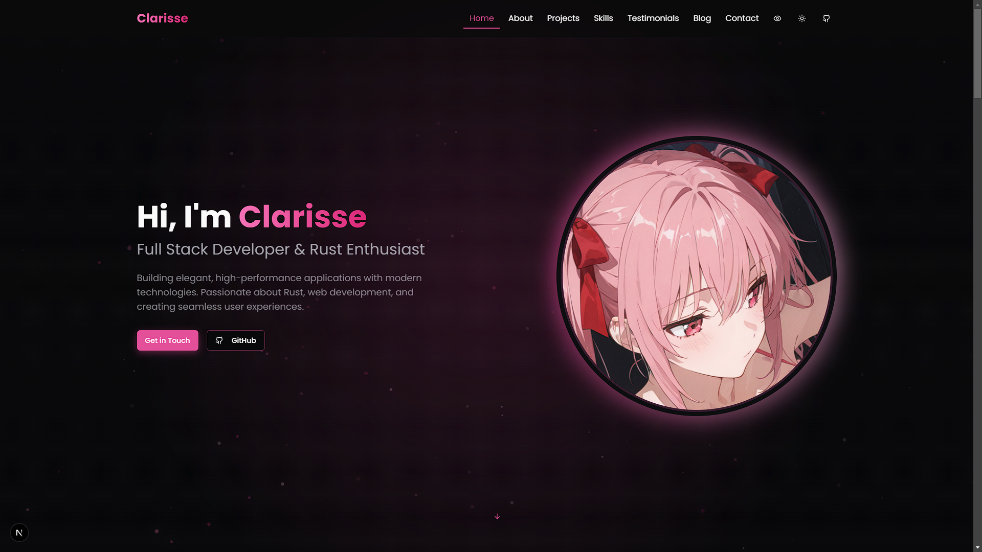
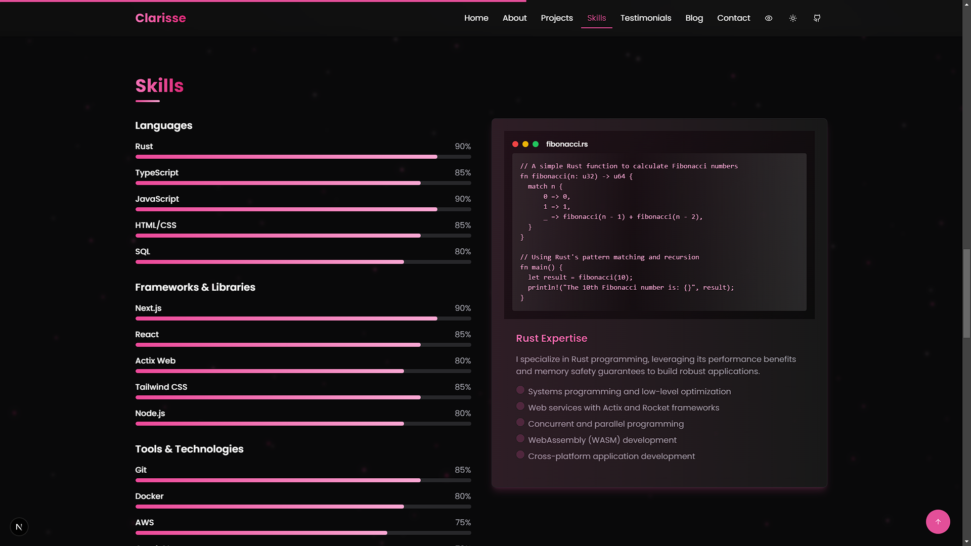
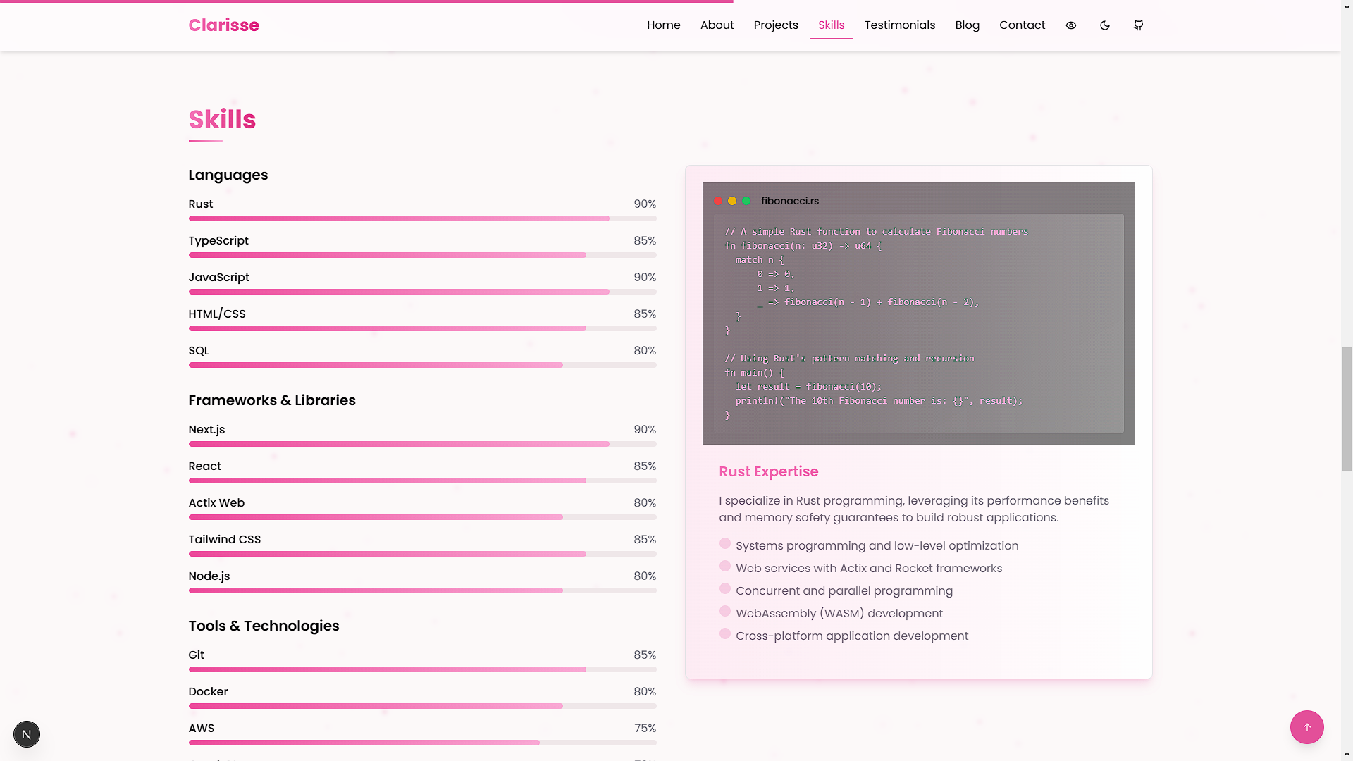
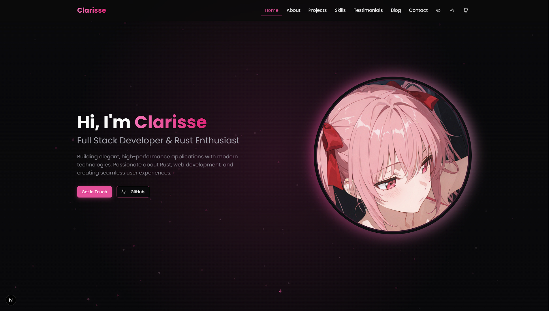
Screenshots
| Feature | Light Mode | Dark Mode |
|---|---|---|
| Home Page | 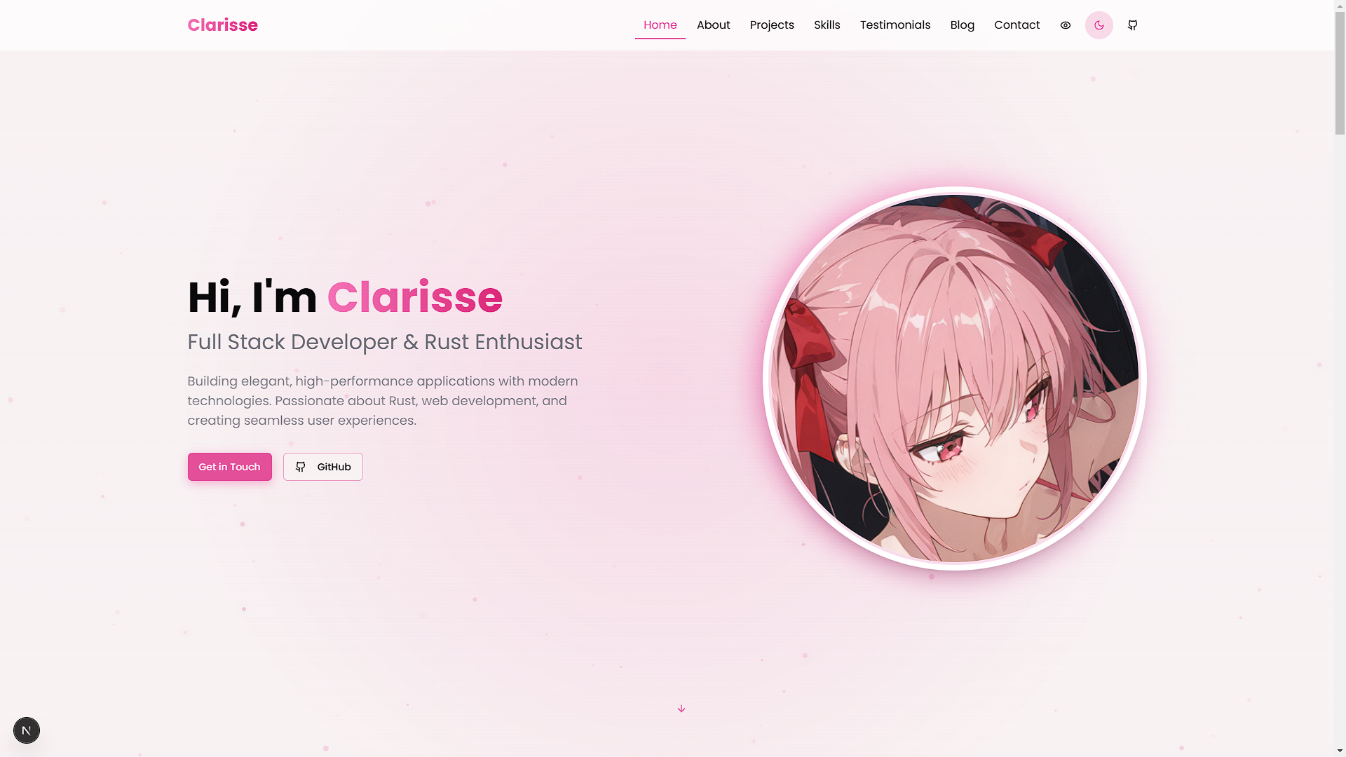 |  |
| Projects Section | 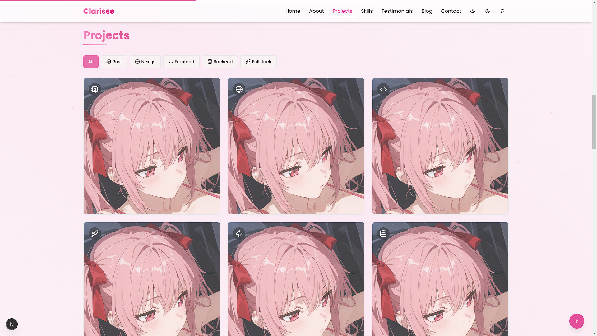 | 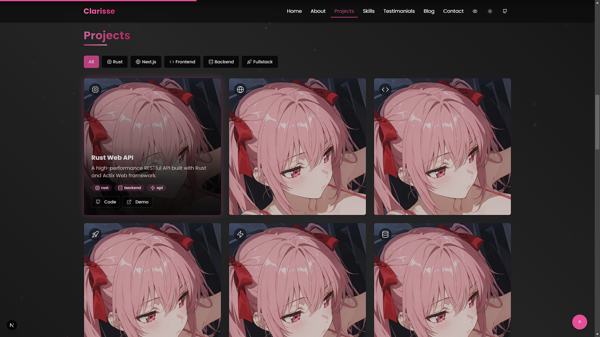 |
| Skills Section |  |  |
Getting Started
Set up and run the portfolio locally with these steps.
Prerequisites
- Node.js: Version 18.0 or higher
- Package Manager:
npmoryarn
Installation
-
Clone the Repository
git clone https://github.com/VoxDroid/Clarisse-Portfolio -
Navigate to the Project Directory
cd Clarisse-Portfolio -
Install Dependencies
npm install # or yarn install -
Start the Development Server
npm run dev # or yarn dev -
Open http://localhost:3000 in your browser to view the portfolio.
Usage
Once the portfolio is running, you can explore and customize it to suit your needs. Below are key sections and how to use them effectively.
Getting Started
- Launch the development server as described above.
- Navigate the site via the browser to preview the default layout and content.
- Use the customization options below to personalize it.
Hero Section
- Purpose: Introduce yourself with a striking headline and background animation.
- How to Use: Edit
components/hero.tsxto update your name, tagline, and image.
Projects Section
- Purpose: Showcase your work with interactive filters and project cards.
- How to Use: Add projects to
components/projects.tsx(see Adding Projects) and test the filters in the browser.
Skills Section
- Purpose: Visualize your skills dynamically.
- How to Use: Update the skills list in
components/skills.tsxwith your expertise.
Settings (Theme Toggle)
- Purpose: Switch between light and dark modes.
- How to Use: Test the toggle in
components/theme-toggle.tsxvia the UI; no additional setup needed.
Customization
Tailor the template to reflect your personal style and content.
Changing Colors
Modify the color scheme in tailwind.config.ts:
// tailwind.config.ts
const config = {
  theme: {
    extend: {
      colors: {
        primary: {
          DEFAULT: "hsl(330, 73%, 60%)", // Customize here
          foreground: "hsl(330, 10%, 95%)",
        },
      },
    },
  },
};
Adjust CSS variables in app/globals.css:
:root {
  --primary: 330 73% 60%; /* Light mode */
}

.dark {
  --primary: 330 73% 70%; /* Dark mode */
}
Updating Content
Edit these files to update your information:
- Hero:
components/hero.tsx - About:
components/about.tsx - Projects:
components/projects.tsx - Skills:
components/skills.tsx - Testimonials:
components/testimonials.tsx - Blog:
components/blog.tsx - Contact:
components/contact.tsx
Adding Projects
Add projects to the projects array in components/projects.tsx:
const projects = [
  {
    title: "Sample Project",
    description: "A brief overview of the project.",
    image: "/images/sample-project.jpg",
    tags: ["React", "TypeScript"],
    github: "https://github.com/voxdroid/sample-project",
    demo: "https://sample-project-demo.com",
    icon: <CodeIcon className="h-6 w-6" />,
  },
  // Add more projects here
];
Customizing Particle Background
Tweak the animation in components/particles-background.tsx:
const particleCount = Math.min(120, Math.floor((window.innerWidth * window.innerHeight) / 9000));
const colors = [
  "rgba(236, 72, 153, 0.5)", // Adjust colors
  "rgba(219, 39, 119, 0.5)",
];
Project Structure
clarisse-portfolio/
├── app/                    # Next.js app directory
│   ├── globals.css         # Global styles
│   ├── layout.tsx          # Root layout
│   └── page.tsx            # Home page
├── components/             # Reusable React components
│   ├── about.tsx           # About section
│   ├── blog.tsx            # Blog section
│   ├── contact.tsx         # Contact form
│   ├── hero.tsx            # Hero section
│   ├── navbar.tsx          # Navigation bar
│   ├── particles-background.tsx # Animated background
│   ├── projects.tsx        # Projects showcase
│   ├── skills.tsx          # Skills visualization
│   ├── testimonials.tsx    # Testimonials display
│   └── theme-toggle.tsx    # Theme switcher
├── public/                 # Static assets (images, etc.)
├── styles/                 # Additional CSS
├── tailwind.config.ts      # Tailwind CSS configuration
├── tsconfig.json           # TypeScript configuration
└── package.json            # Dependencies and scripts
Built With
- Next.js - React framework for production-grade apps
- TypeScript - Typed JavaScript for reliability
- Tailwind CSS - Utility-first CSS framework
- Framer Motion - Animation library
- Lucide Icons - Consistent icon set
- shadcn/ui - Reusable UI components
Dependencies
To run this project, the following Node.js packages are required (listed in package.json):
next- Core frameworkreactandreact-dom- React librariestypescript- Type checkingtailwindcss- Stylingframer-motion- Animations@lucide/react- Icons- Various
shadcn/uidependencies (e.g.,@radix-ui/*)
Install them with:
npm install
Releases
- Check the Releases page for versioned updates.
- Each release includes notes on new features, bug fixes, and improvements.
- The source code is the primary distribution method; no pre-built binaries are provided.
Key Features Explained
Animated Particle Background
A semi-transparent particle system moves diagonally, customizable in components/particles-background.tsx.
Interactive Project Filters
Category filters with animated icons and glow effects, implemented in components/projects.tsx.
Custom Tooltip System
Toggleable tooltips managed in context/tooltip-context.tsx for enhanced interactivity.
Responsive Design
Mobile-first design ensures compatibility across devices, built into all components.
License
This project is licensed under the MIT License. See the license file for details.
Acknowledgments
- shadcn/ui - Reusable UI components
- Lucide Icons - Beautiful icon library
- Framer Motion - Smooth animations
- Tailwind CSS - Efficient styling
- Next.js - Robust framework
Contact
Questions or feedback? Reach out:
- GitHub: @VoxDroid
Contributing
Contributions are welcome! Please read our Contributing Guide for details on how to contribute, and review our Code of Conduct to ensure a positive and inclusive community.
To contribute:
- Fork the repository: https://github.com/VoxDroid/Clarisse-Portfolio
- Create a feature branch (
git checkout -b feature-name) - Commit your changes (
git commit -m "Add feature") - Push to the branch (
git push origin feature-name) - Open a pull request
Support
For support, please refer to our Support Guide. If you encounter security issues, please review our Security Policy.
If you find this project useful, consider supporting its development:
- Ko-fi: Buy me a coffee

- Star the Repository: Give it a star on GitHub
- Report Issues: Submit bugs or suggestions on the Issues page
![vercel[bot]](https://avatars.githubusercontent.com/in/8329?v=4)