

Shibaccus Web
An innovative, modern website delivering tech solutions. Built with Next.js and TypeScript.
Live Demo: Checkout the deployed version at shibaccus-web.vercel.app
Badges


Table of Contents
- Features
- Screenshots
- Getting Started
- Usage
- Customization
- Project Structure
- Built With
- Dependencies
- Key Features Explained
- License
- Acknowledgments
- Contributing
- Contact
Features
- Modern UI/UX: Rose gold-themed design with glass morphism effects.
- Responsive Layout: Optimized for mobile, tablet, and desktop devices.
- Interactive Animations: Smooth transitions powered by Framer Motion.
- Dark/Light Mode: Seamless theme switching with local storage support.
- Comprehensive Pages: Includes Home, Services, Portfolio, Blog, Pricing, About, Contact, and FAQ.
- Accessibility: ARIA-compliant and keyboard-navigable.
- Performance Optimized: Fast load times with optimized assets and Next.js features.
- Blog Functionality: Articles with search capabilities.
- Contact Form: Validated form for user inquiries.
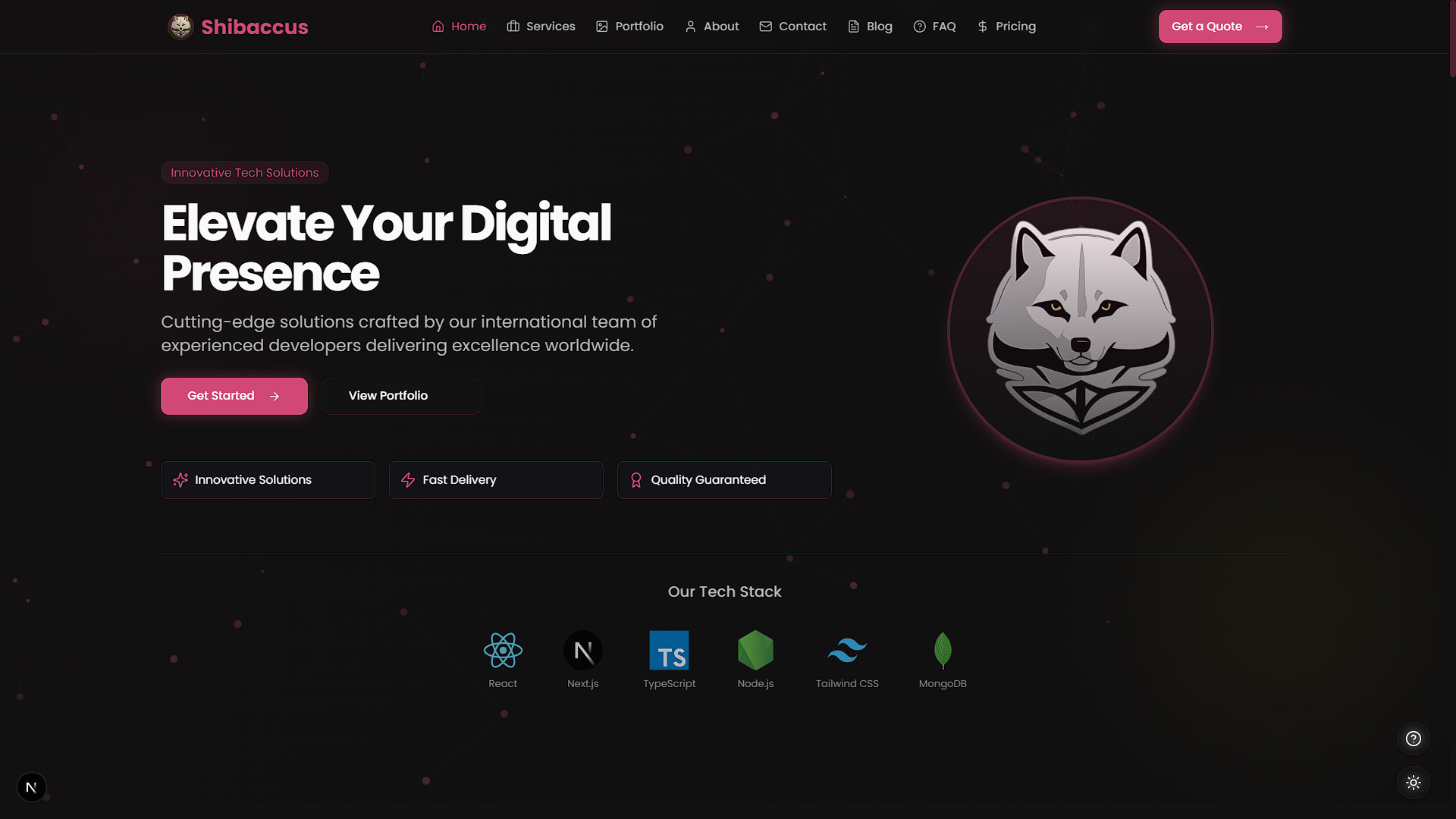
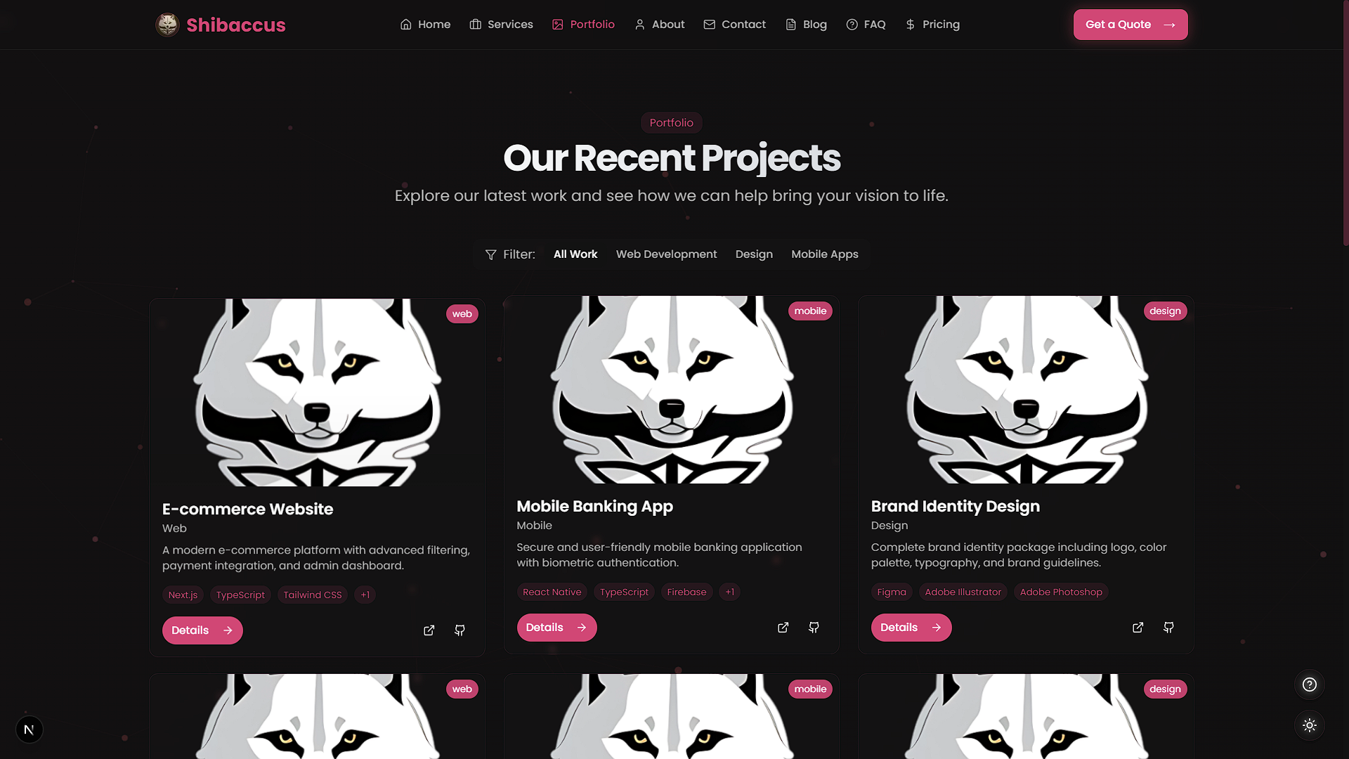
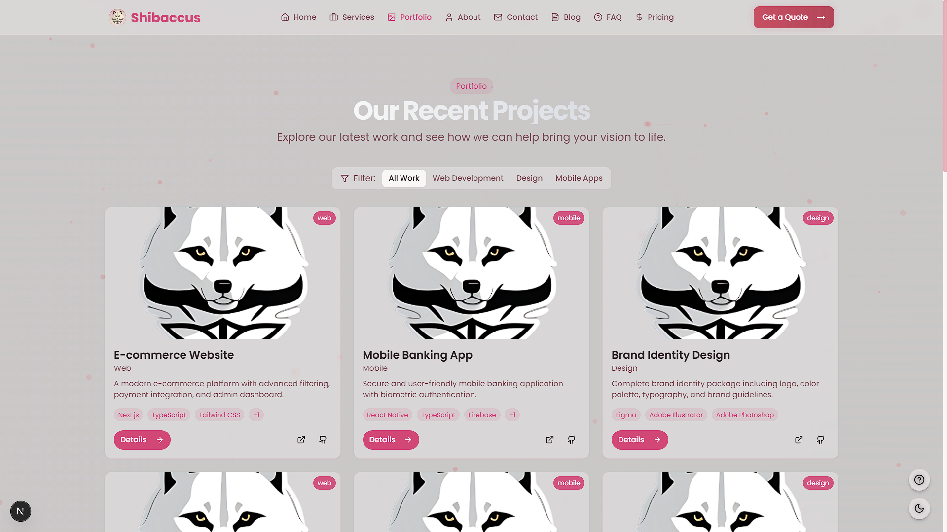
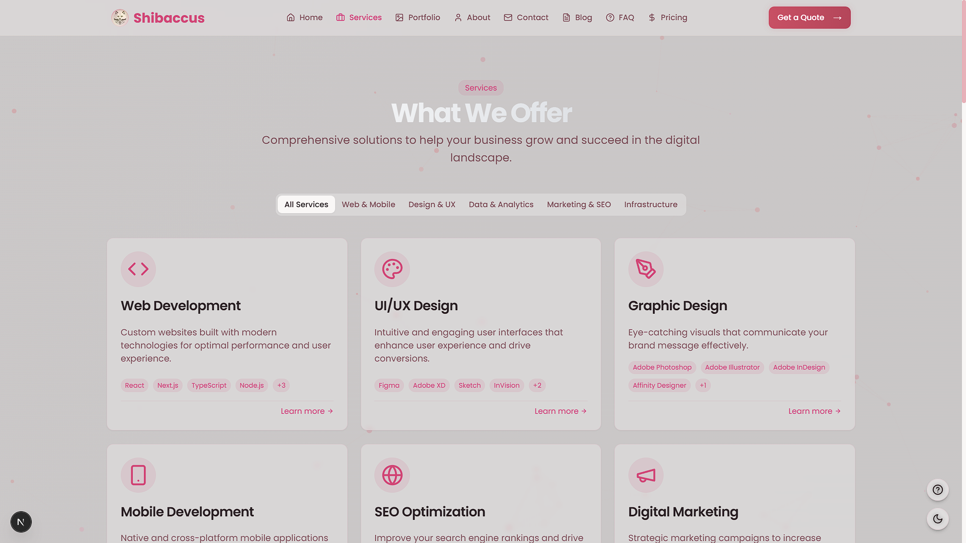
Screenshots
| Feature | Light Mode | Dark Mode |
|---|---|---|
| Home Page | 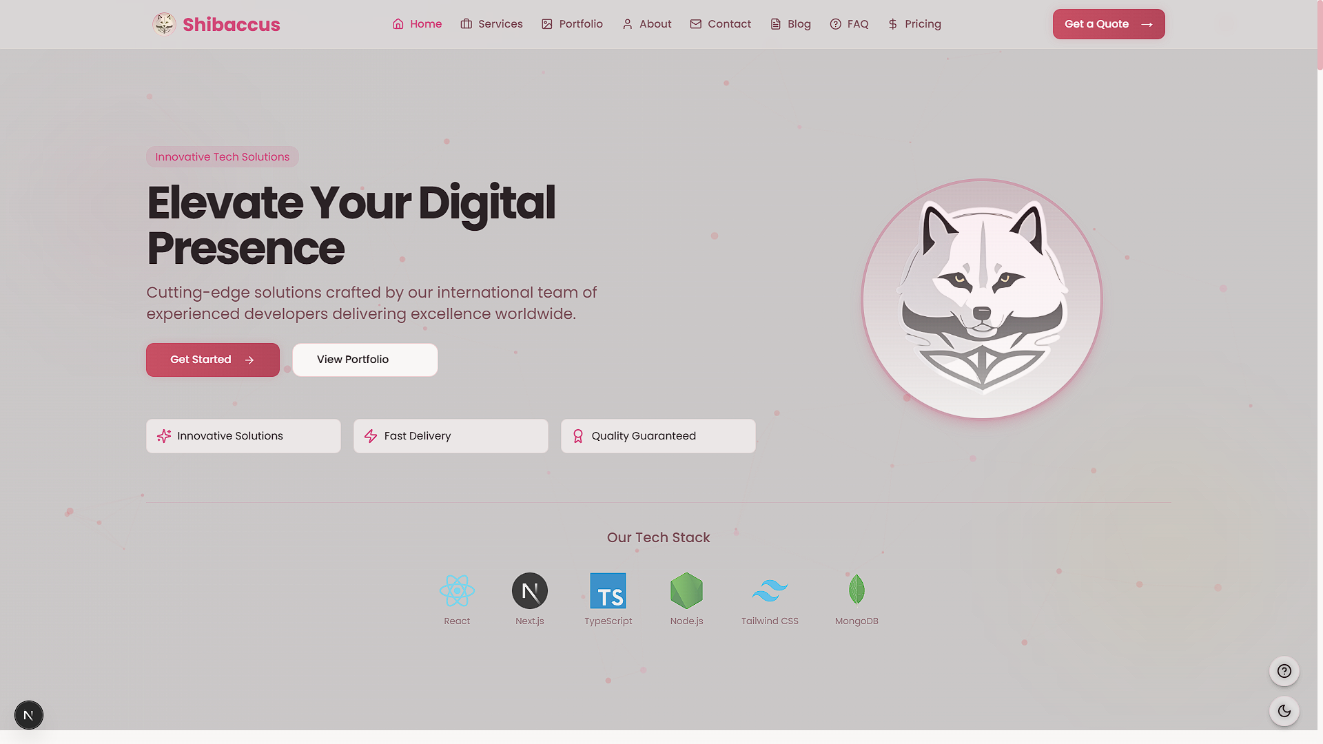 |  |
| Services Section |  | 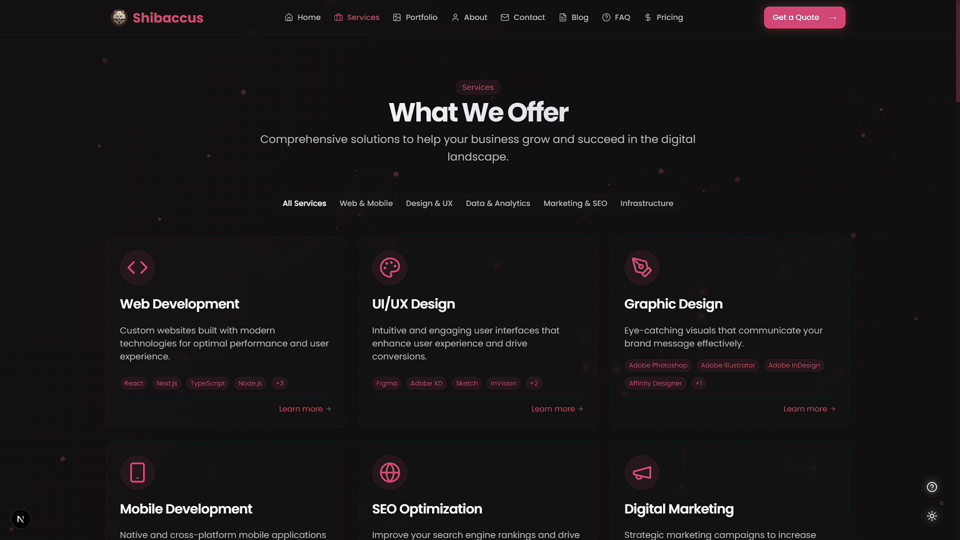 |
| Portfolio Section |  |  |
Getting Started
Set up Shibaccus Web locally with these steps.
Prerequisites
- Node.js: Version 18.0 or higher
- Package Manager:
npm
Installation
-
Clone the Repository
git clone https://github.com/VoxDroid/Shibaccus-Web.git -
Navigate to the Project Directory
cd Shibaccus-Web -
Install Dependencies
npm install -
Start the Development Server
npm run dev -
Open http://localhost:3000 in your browser to view the site.
Usage
Environment Variables
Create a .env.local file in the root directory:
NEXT_PUBLIC_SITE_URL=http://localhost:3000
Commands
- Development:
npm run dev - Build:
npm run build - Production:
npm run start - Lint:
npm run lint - Format:
npm run format
Key Sections
- Home: Edit
app/page.tsxfor hero, services, and testimonials. - Services: Update
app/services/for offerings and details. - Portfolio: Modify
app/portfolio/to showcase projects. - Blog: Adjust
app/blog/for articles and search.
Customization
Changing Colors
Modify the theme in tailwind.config.ts:
theme: {
  extend: {
    colors: {
      primary: "#e15e66", // Rose gold
    },
  },
};
Update CSS variables in app/globals.css:
:root {
  --primary: #e15e66; /* Light mode */
}
.dark {
  --primary: #e15e66; /* Dark mode */
}
Updating Content
Edit key components:
- Home:
app/page.tsx - Services:
app/services/ - Portfolio:
app/portfolio/ - Blog:
app/blog/ - Contact:
app/contact/
Adding Animations
Tweak Framer Motion settings in components like components/animate-in-view.tsx.
Project Structure
shibaccus-web/
├── app/                    # Next.js app directory
│   ├── about/              # About page
│   ├── blog/               # Blog pages
│   ├── contact/            # Contact page
│   ├── faq/                # FAQ page
│   ├── portfolio/          # Portfolio pages
│   ├── pricing/            # Pricing page
│   ├── services/           # Services pages
│   ├── api/                # API routes
│   ├── globals.css         # Global styles
│   ├── layout.tsx          # Root layout
│   └── page.tsx            # Home page
├── components/             # Reusable components
│   ├── ui/                 # Shadcn UI components
│   ├── animate-in-view.tsx # Animation component
│   ├── hero.tsx            # Hero section
├── hooks/                  # Custom hooks
├── lib/                    # Utility functions
├── public/                 # Static assets
│   ├── logo/               # Logo images
├── styles/                 # Additional styles
├── tailwind.config.ts      # Tailwind configuration
├── next.config.js          # Next.js configuration
├── tsconfig.json           # TypeScript configuration
└── package.json            # Dependencies and scripts
Built With
- Next.js - React framework with App Router
- TypeScript - Type safety
- Tailwind CSS - Utility-first styling
- Framer Motion - Animations
- Shadcn UI - Customizable components
- Vercel - Deployment platform
- React Hook Form - Form handling
- Lucide React - Icon library
Dependencies
Key packages (from package.json):
nextreact,react-domtypescripttailwindcssframer-motionlucide-reactreact-hook-form
Install with:
npm install
Key Features Explained
Glass Morphism Design
A modern UI effect applied via Tailwind CSS and custom styles in app/globals.css.
Theme Switching
Toggle between dark/light modes with ThemeToggle component, persisting via local storage.
Responsive Design
Mobile-first approach with Tailwind breakpoints for all screen sizes.
Performance Optimization
Leverages Next.js server components, image optimization, and lazy loading.
License
Licensed under the MIT License. See the license file for details.
Acknowledgments
Contributing
Contributions are welcome! Please read our Contributing Guide for details on how to contribute, and review our Code of Conduct to ensure a positive and inclusive community.
To contribute:
- Fork the repository: https://github.com/VoxDroid/Shibaccus-Web
- Create a feature branch (
git checkout -b feature-name) - Commit your changes (
git commit -m "Add feature") - Push to the branch (
git push origin feature-name) - Open a pull request
Contact
Questions or feedback? Reach out:
- GitHub: @VoxDroid
Support
For support, please refer to our Support Guide. If you encounter security issues, please review our Security Policy.
If you find this project useful, consider supporting its development:
- Ko-fi: Buy me a coffee

- Star the Repository: Give it a star on GitHub
- Report Issues: Submit bugs or suggestions on the Issues page

![vercel[bot]](https://avatars.githubusercontent.com/in/8329?v=4)